Industry
Logistics
Client
SwiftLog
SwiftLog © Branding
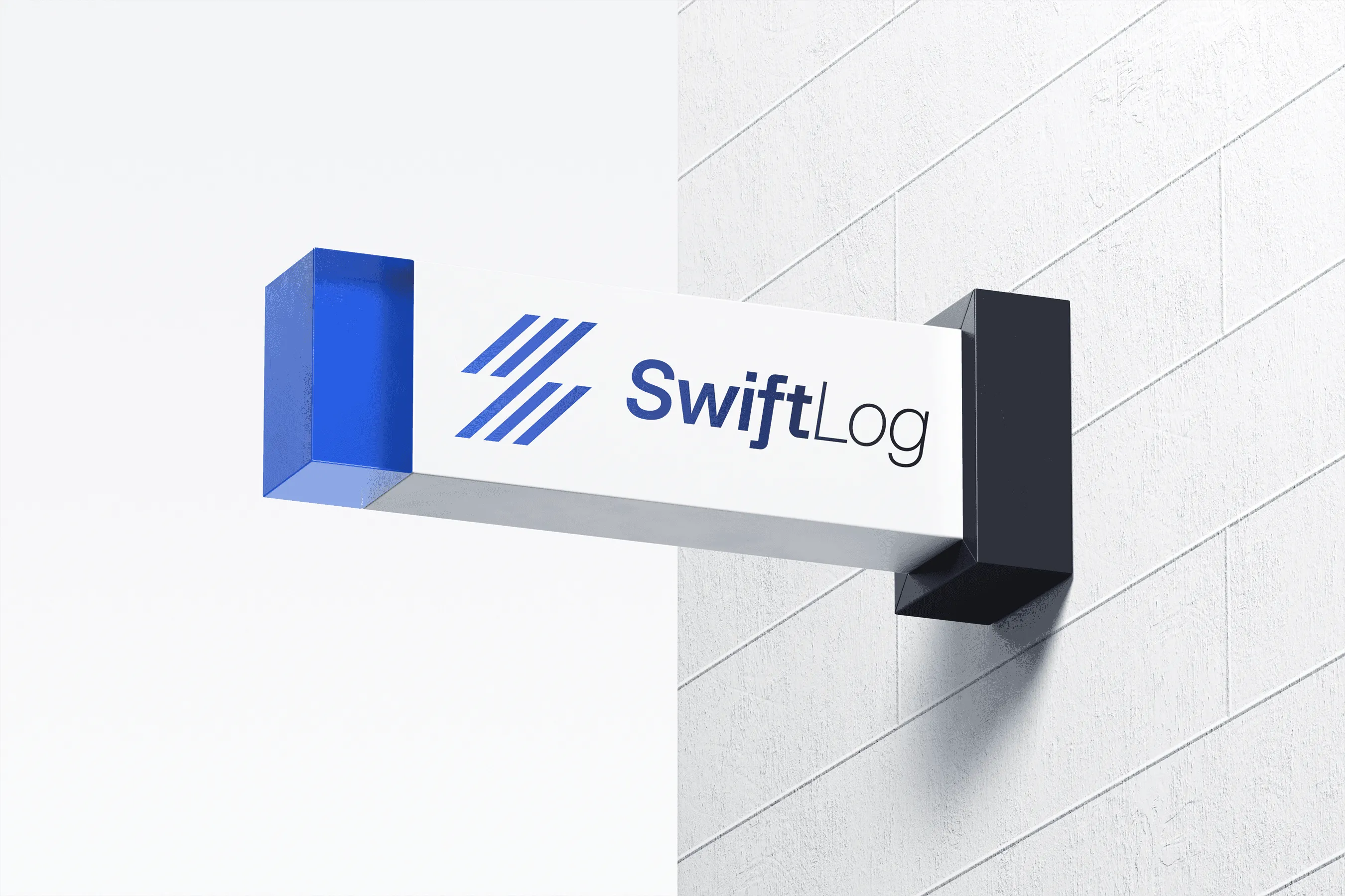
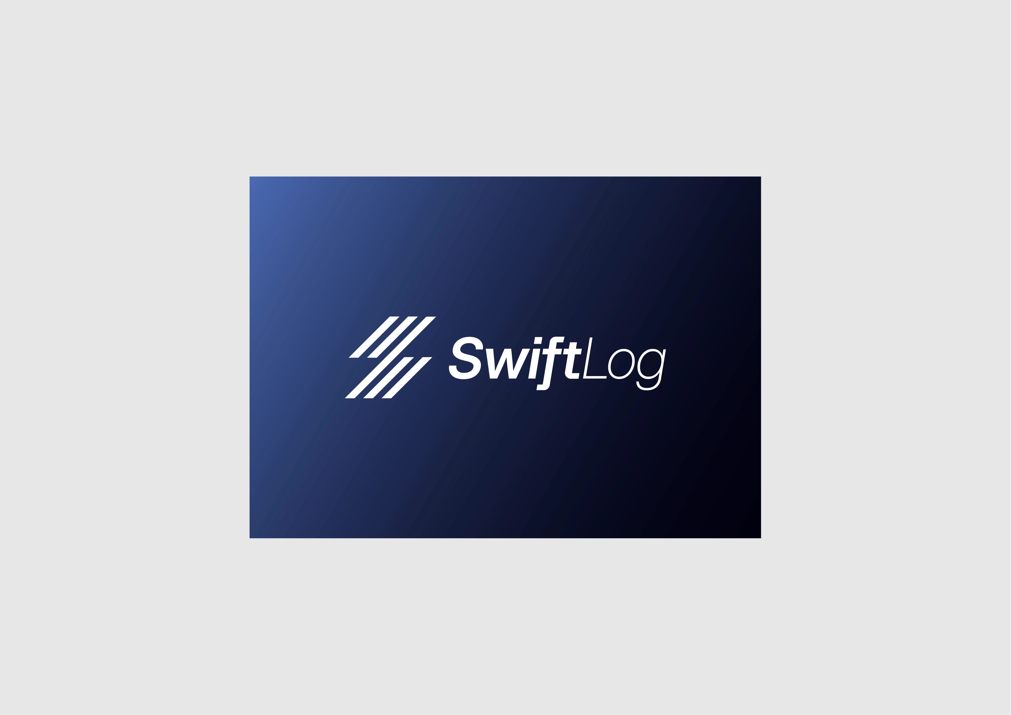
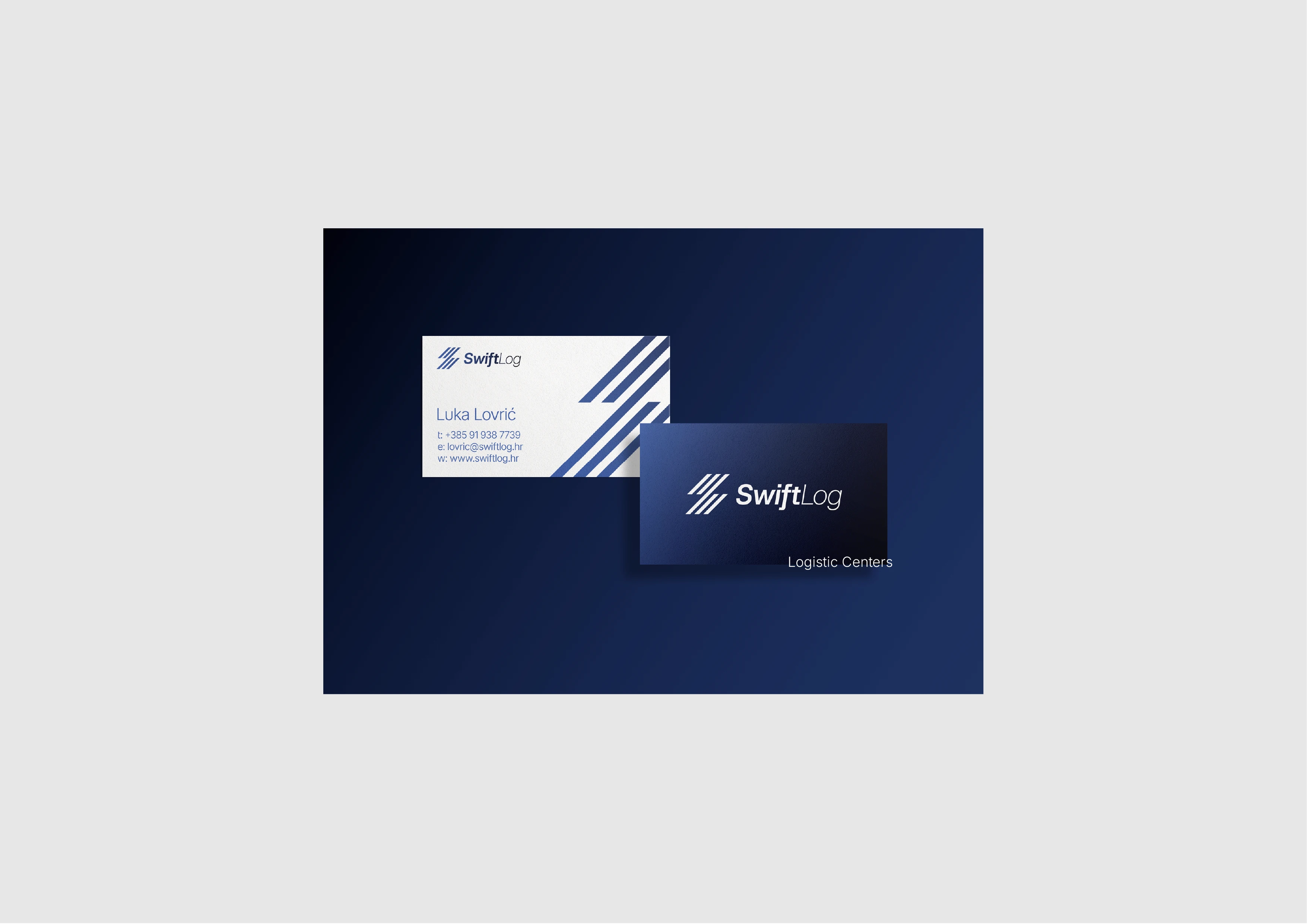
Revolutionizing Logistics: Enhancing business processes with SwiftLog smart logistic systems
For SwiftLog, we created a brand identity that feels fast, organized, and reliable. As a logistics company focused on movement and efficiency, SwiftLog needed a visual identity that clearly communicates trust, direction, and growth. The logo is built around the letter S, using clean diagonal lines to suggest speed, structure, and forward motion. Combined with a strong blue color palette and a modern wordmark, the branding gives SwiftLog a professional and recognizable look across all materials — from digital use to vehicles, signage, and company documents.